Theme Editor, Medium
While Medium users value the consistent, clean reading experience the platform offers, there is little room for personalization and creative expression. Our hypothesis was: If publications were more unique, we could move towards a more relational Medium.
My Role
Lead product designer
Worked Closely with: Creative Director, Product manager, Head of Product, Lead engineer
Design principles
Expressive control
I want my blog’s style to reflect my unique perspective and the content I publish.
Progressive control
Show me smart and simple presets to make basic changes, but give me granular control when I dig in.
Show, don’t tell
Where and when possible, show me visuals interfaces that easily help me scan my choices.
Prioritize high impact
I want to be one or two clicks away from creating big splashes that quickly make my blog look differentiated.
Content first
Medium should let me write and publish without a lot of work up front. Don’t make me think about presentation or distribution unless I want to.
Initial wireframes
In the beginning, I was focused on theme selection, color palette customization, and navigating to a theme editor where the user could customize further.
Version 1:
The user navigates through a panel of customizable components, expanding to reveal highly granular controls. User switches between homepage and article context as they see a preview of the selected context on the right.
Progressive control
We found that people were not interested in the level of granular control from version one. Even designers we spoke with wanted simple presets with the ability to apply custom values when desired. We applied progressive control to Typography, Color, and Scale.
In addition to the ‘Create custom’ feature, we decided to only surface the most impactful properties first, revealing more beneath to avoid cognitive overhead.
Explicit Intent
In the beginning, I thought people might want to see all available controls. We later realized the experience was becoming overwhelming, especially as we began to cater to a wider audience.
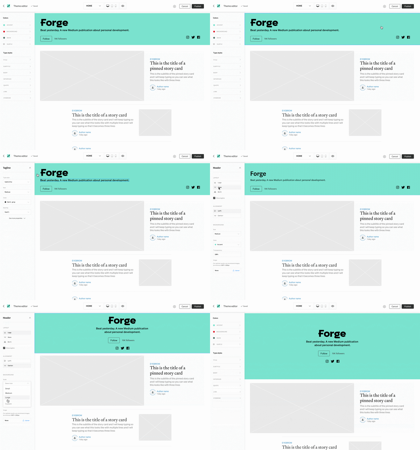
As an extension of Progressive Control, we moved towards a more focused behavior. The panel reflects user’s intent –– we only expose what they have clicked on, and show immediate visual feedback to reinforce connections from preview to panel.
Color complexity
Medium uses a unique color logic system to ensure accessibility and color harmony in the cases of overlapping hues.
My challenge was to offer a UX that allowed for expressive control while also leveraging our derivation logic. What is automated vs. what can be controlled? How might I achieve both?
This is my initial color management exploration before shifting to the below solutions – focusing less on user input and more automation for greater impact.
Beta testing
We recently announced beta testing and Obama’s team was among the first users.


